Implementing my Website in Flask - Part 2
Oct 11, 2021
This is part 2 in a series about implementing a personal blog in Python. In this blog post, I'd like to cover some of the HTML/CSS choices that I made. This has been a iterative process, and I'm sure after I publish this post I'll make adjustments (maybe even during this post as I explain my rationale). If you look at the commit history, you can see I've come a long way from the first static HTML page, and what Flask now serves.
If you're interested, other parts of this series can be found below:
- Part 1: Introduction and Project Outline
- Part 2: Setting Up Static Resources and Styles
- Part 3: Flask and Jinja
- Part 4: Managing Posts and Highlighting Code Blurbs
- Part 5: Deployment to Netlify
- Part 6: RSS Feed
If you are interested in further details, you can find the source of this blog on Github.
General HTML Choices
I try to design code that is maintainable and easy to understand so that I (or someone else) can pick it up a year from now and still understand what I did. Therefore I try to stick to as many of the recommended HTML styles and best practices as I can, and use semantic HTML .
A lot of these things are pretty easy, and I just had to remember to check them off as I was writing the HTML. Things like:
- Declaring the document type to be
<!DOCTYPE html>at the top of a page. - Avoiding long code lines - I tried to keep mine under 100 characters unless dynamically rendered.
-
Including the
<title>tag. Bonus: "Ramblings of a Software Dev" is shown on the tab. -
Setting the
langattribute, charset, and viewport. These help search engines and browsers understand what they're looking at.
All together, the beginning of the document looks like:
1
2
3
4
5
6
<!DOCTYPE html>
<html lang='en'>
<head>
<meta charset='utf-8'>
<meta name='viewport' content='width=device-width, initial-scale=1'>
<title>Ramblings of a Software Dev</title>
Next, to help out the browser, any search engines that hit my page, and future me, I wrapped my contents in semantic HTML. What this looks like is:
-
All my navigation content goes in a
<nav>tag. -
All my blog content (posts, archive, "about" page) goes within the
<main>tag. -
Within my
<main>block, I have several<article>s. -
At the end of it all, my footer content goes within a
<footer>tag.
The semantic HTML almost makes the page self-documenting, instead of using a bunch of
<div>s. Another added benefit was that the tags were an easy way to split up the
content into different Flask templates (more on that in a later blog post).
If you view the source of my main page you can see there's a few more tags that I didn't mention. These are for search engine optimization, which deserves its own post.
Responsive CSS
Again looking at the page source, you'll see two stylesheets. One (pygments.css) is for the code rendering feature, which I'll cover in a separate post. The stylesheet.css file is the generic stylesheet for the project.
I elected to use flexboxes whenever there is a container that could be larger than a mobile phone screen. The benefit is that it dynamically renders to fit the smaller screen without the need for JavaScript. Specifically, these features are the navigation at the top of the screen and the general page content (whether that be the blog post, about page, or archive).
Specific to the nav bar, each element is contained within a <div> styled with
white-space: nowrap so they couldn't break. Then, the nav bar was styled like
so:
1
2
3
4
5
nav {
display: flex;
flex-flow: row wrap;
justify-content: space-evenly;
}
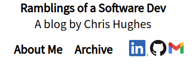
This made the unbreakable pieces wrap to the next line on small mobile screens, but stay on a single line on wide screens. For example:
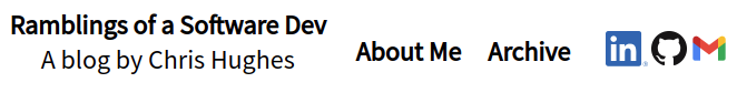
However, I did have to hide the social media block for mobile, because it was flowing onto a
third line. I accomplished that with a @media block:
1
2
3
4
5
@media (max-width: 40em) {
.nav-social-media-block div * {
display: none;
}
}
I had to experiment to determine the max-width to use.
Another benefit of flexbox is that it's really easy to center. For example, my main page contents can be styled like this:
1
2
3
4
5
.page-content {
align-items: center;
display: flex;
flex-direction: column;
}
Then, by setting a max-width, the page can be rendered in the middle of the
screen at a size that's easy to read.
The only place where I didn't go with the flexbox is the pagination feature at the bottom. Instead, I split this into a grid with a width of 100%. The "Prev" button went in one column and the "Next" button went on the other. It seemed like the most logical choice since they should always be next to each other (instead of wrapping), even when the page is small.
Here's the related CSS:
1
2
3
4
5
6
7
8
9
10
11
12
13
14
.page-control-section {
display: grid;
width: 100%;
}
#next-nav {
grid-column: 2 / span 1;
grid-row: 1 / span 1;
text-align: right;
}
#prev-nav {
grid-column: 1 / span 1;
grid-row: 1 / span 1;
text-align: left;
}
Note that the .page-control-section class is the containing div of the "Prev"
and "Next" buttons. The #next-nav and #prev-nav IDs are
the actual buttons.
The main benefit of using a grid is that the two columns will always remain on a single row, even on smartphone screens.
Fonts
I'm not too picky about my font. I just needed something that was readable and conventional, so I picked a popular sans-serif font from Google Fonts.
There's two things that need to be done to use the font. First, load the font style in the head of the html:
1
2
3
4
5
6
<!DOCTYPE html>
<html lang='en'>
<head>
<link rel='preconnect' href='https://fonts.googleapis.com'>
<link rel='preconnect' href='https://fonts.gstatic.com' crossorigin>
<link href='https://fonts.googleapis.com/css2?family=Roboto+Mono&display=swap' rel='stylesheet'>
Google is really helpful in this regard, as they provide the tags to use in the HTML after picking the desired font. Then I can just copy/paste.
Then load the font in the CSS:
1
2
3
body {
font-family: 'Source Sans Pro', sans-serif;
}
I could get away with loading the font in the body since I'm using the same font throughout the site. Of course, you could load it in a more specific tag, class, or ID if you needed to.
Meta Tags
Meta tags were something I didn't realize I needed until I tried to post to LinkedIn. Without them, LinkedIn's link preview was super ugly. It looked something like this:

Turns out, LinkedIn uses a Post Inspector on all of its links. It gets the necessary information like the website logo, author, title, etc from meta tags. If they're not found, it does its best to parse the information from the HTML. However, it doesn't always return an expected result. The Post Inspector is pretty helful in providing what tags need to be defined. Using the result from my website, I added these tags to the header:
1
2
3
4
5
6
7
<meta property='og:locale' content='en_US' />
<meta property='og:type' content='article' />
<meta property='og:title' content='Ramblings of a Software Dev' />
<meta property='og:description' content='Blog and portfolio for Chris Hughes' />
<meta property='og:site_name' content='Ramblings of a Software Dev' />
<meta property='og:image' content='/static/img/logo.png' />
<meta name='author' content='Chris Hughes' />
Now an acceptable image is displayed over the (no longer repeated) title of the website.
It's not just LinkedIn that uses these tags. Search engines and other applications that wish to show a link preview (text messaging apps, Facebook, etc) use these tags to display a preview of the website to entice users to click the link (or not).
The Favicon
The last thing I'd like to cover is how to add a neat icon to the current tab or favorites menu, called a "Favicon." These icons are pretty easy to add and make the website look a little bit more polished.
Wikipedia's favicon article is really useful in understanding what browsers and applications are looking for when displaying a favicon. In summary, at a minimum, websites need to provide one icon size and any modern browser or application will scale down to the size it needs.
Both Android and iOS have the capability of saving a website to the home screen. Instead of the brower icon, the website favicon will be displayed. Android requires an icon size of 192x192, while iOS requires up to 180x180. I chose 192x192 for my single favicon to meet the Android requirement, since it can just be scaled down for iOS.
Internet browsers and Android use the "icon" link to find which image should be used for the favicon, while iOS uses "apple-touch-icon". Here's the code I used to satisfy both cases:
1
2
3
4
5
6
7
8
<link href='/static/icon/favicon-192x192.png'
rel='icon'
sizes='192x192'
type='image/png'>
<link href='/static/icon/favicon-192x192.png'
rel='apple-touch-icon'
type='image/png'
sizes='192x192'>
And that's it! Now I have a neat icon next to my title on the current tab and in the favorites menu.
With the favicon out of the way, that's everything that I wanted to cover as far as design choices for the HTML and CSS. Next week, we can get to more of the fun stuff - the Python backend!